Problem
The developers had a vision for a retro‑futuristic board game and a solid grasp of the mechanics, but no clear answers on how the setting should look and feel in practice. A set of design questions had to be answered from scratch.
- Player identity required a way to make each heraldry distinctive and recognizable
- Visual language had to translate the retro‑futuristic setting into shapes, colors, and UI elements
- Game feel had to stay alive and dynamic throughout the match
- In‑game currency needed a look
- Purchasing and trading required a defined set of items worth buying and selling
Solution
A deep dive into retro‑futurism across culture and art, with a focus on period devices and hardware, produced a working set of visual references and materials
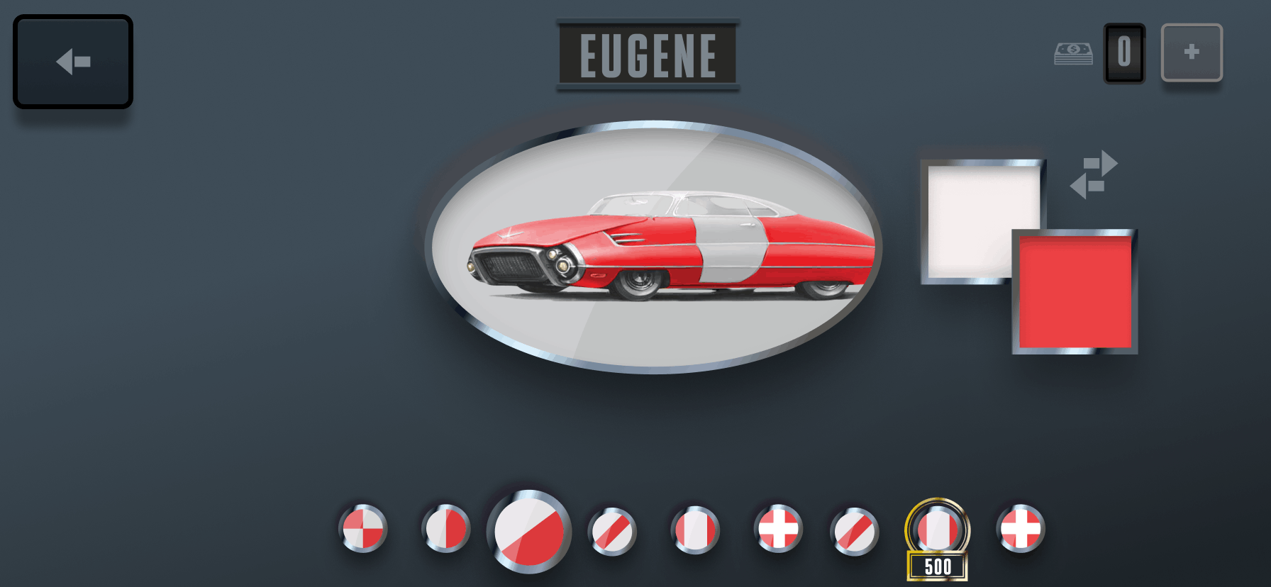
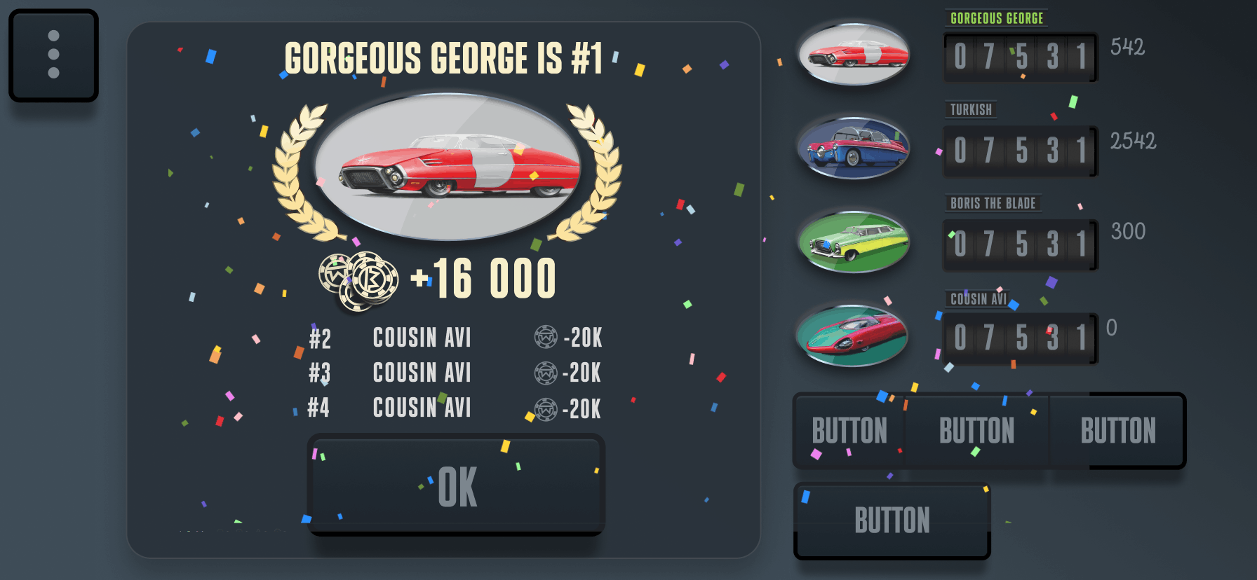
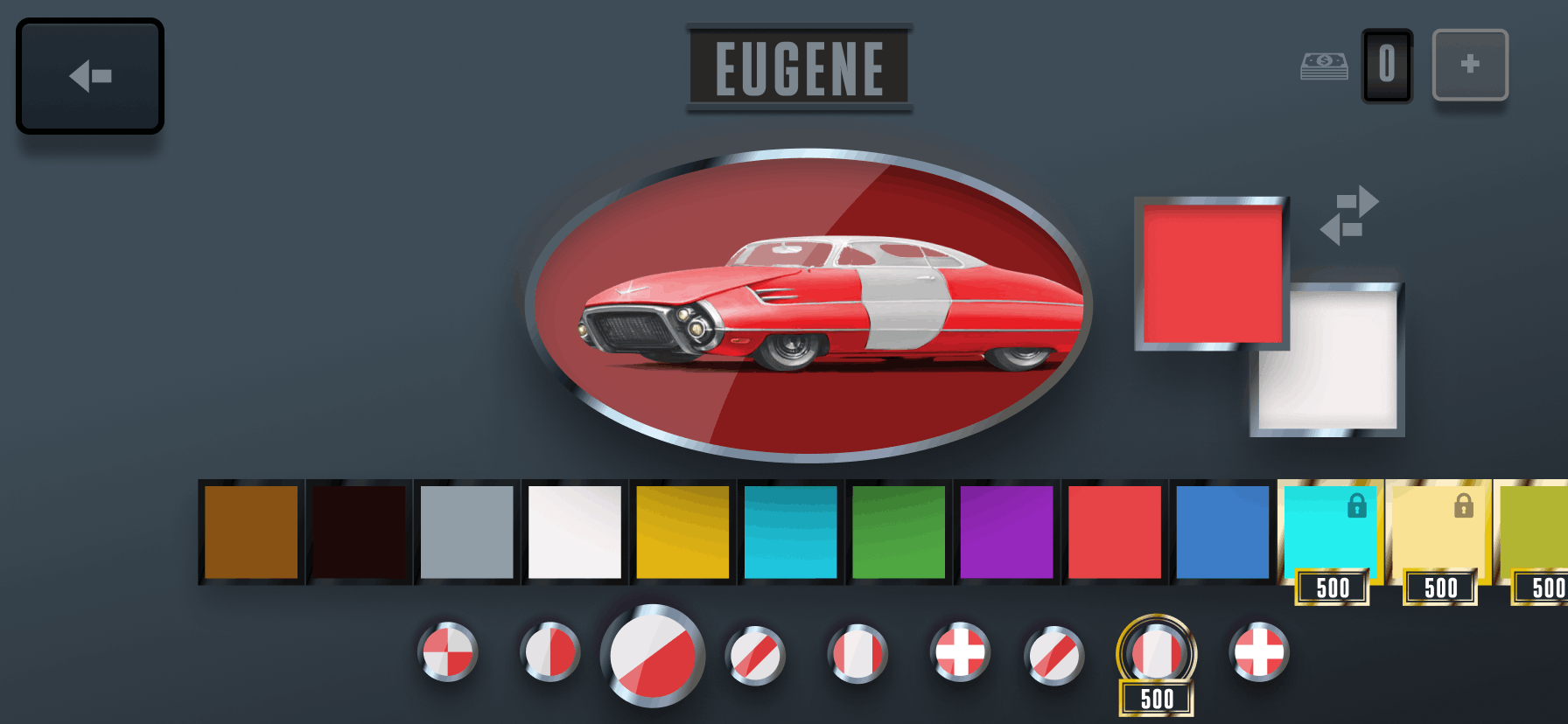
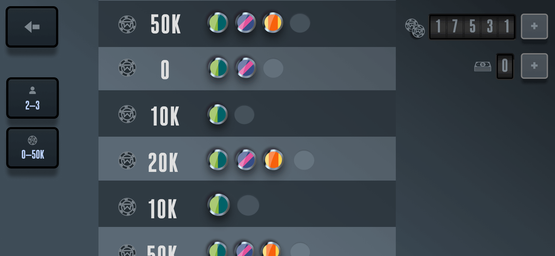
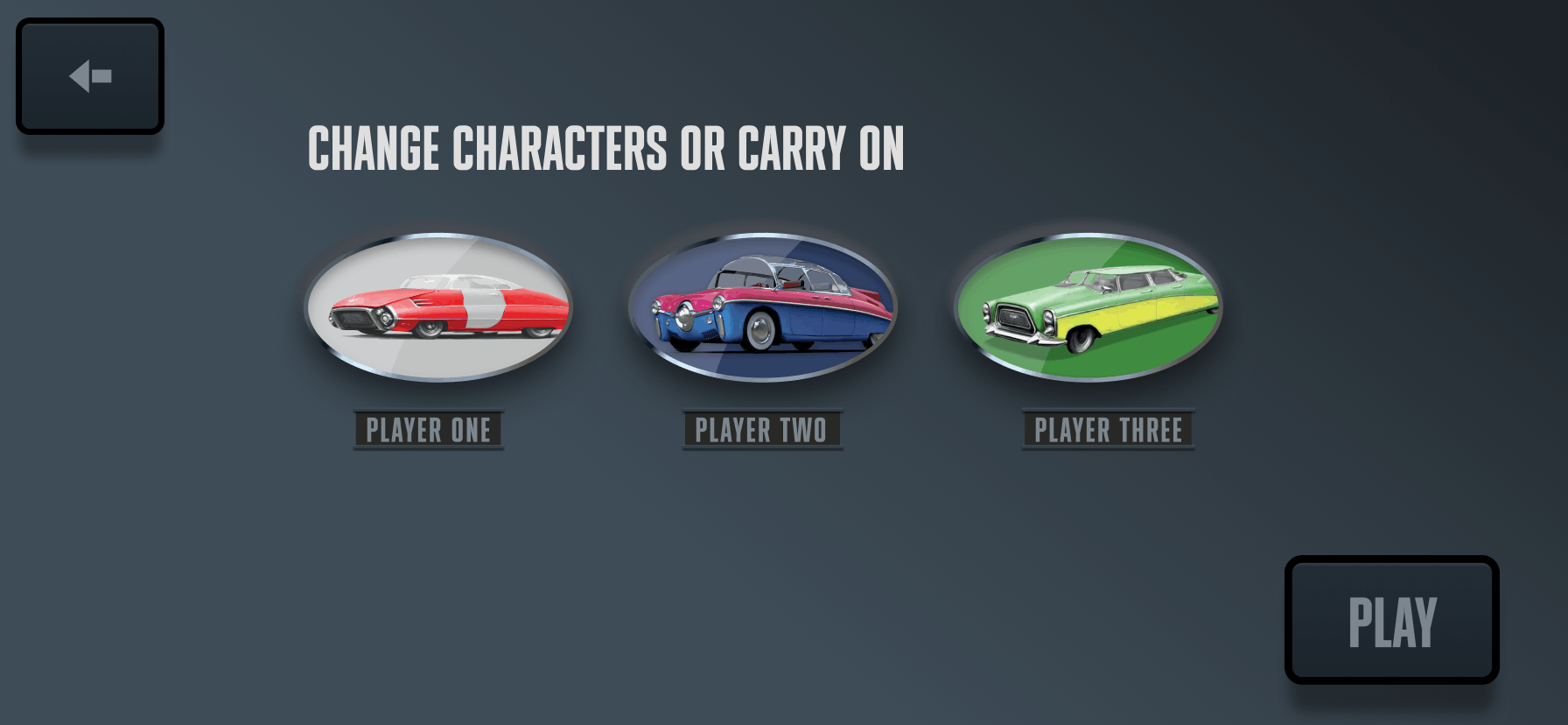
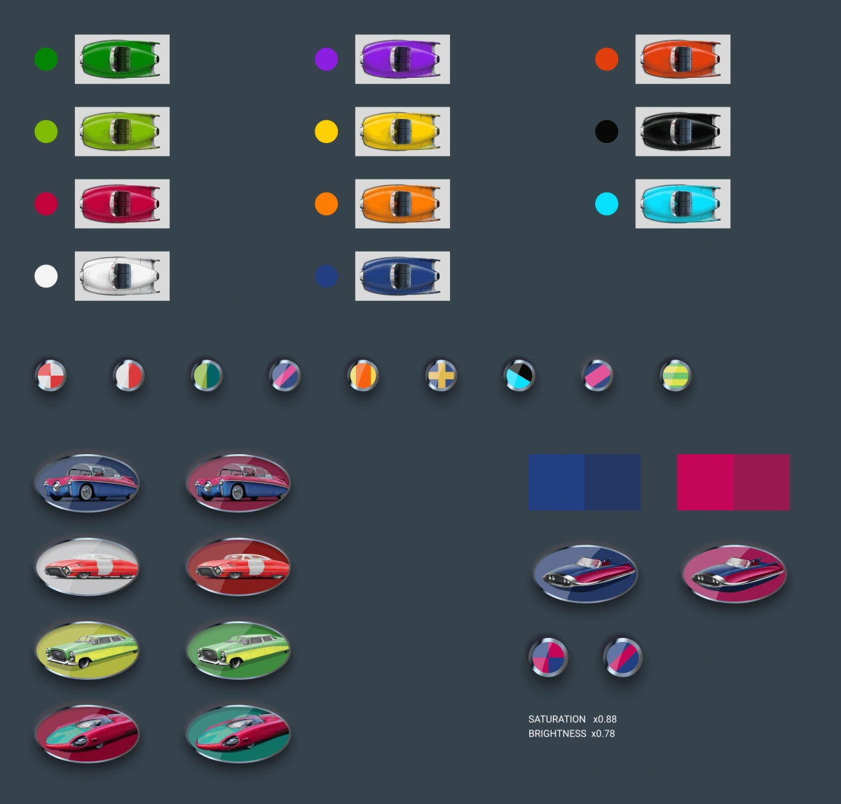
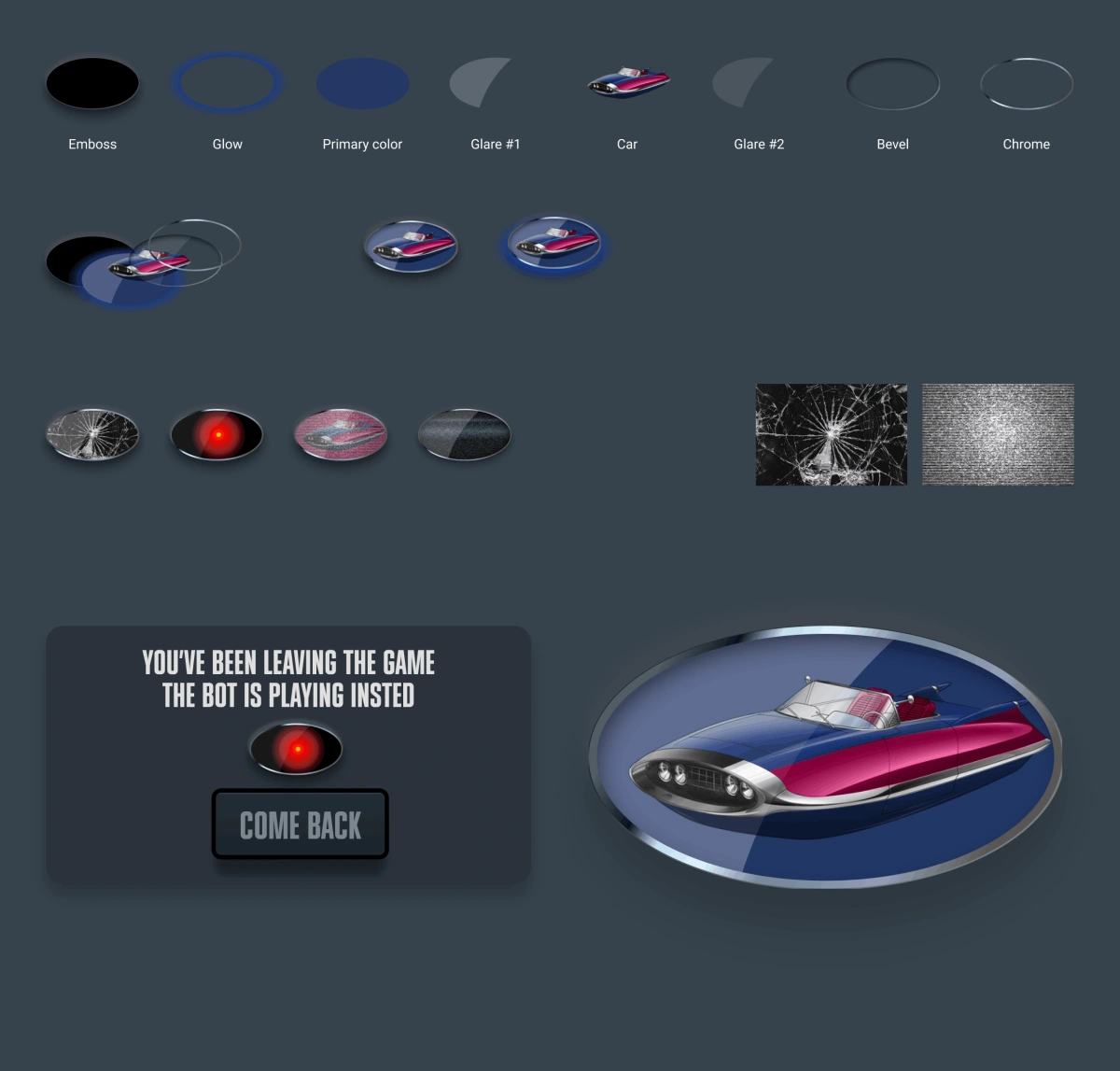
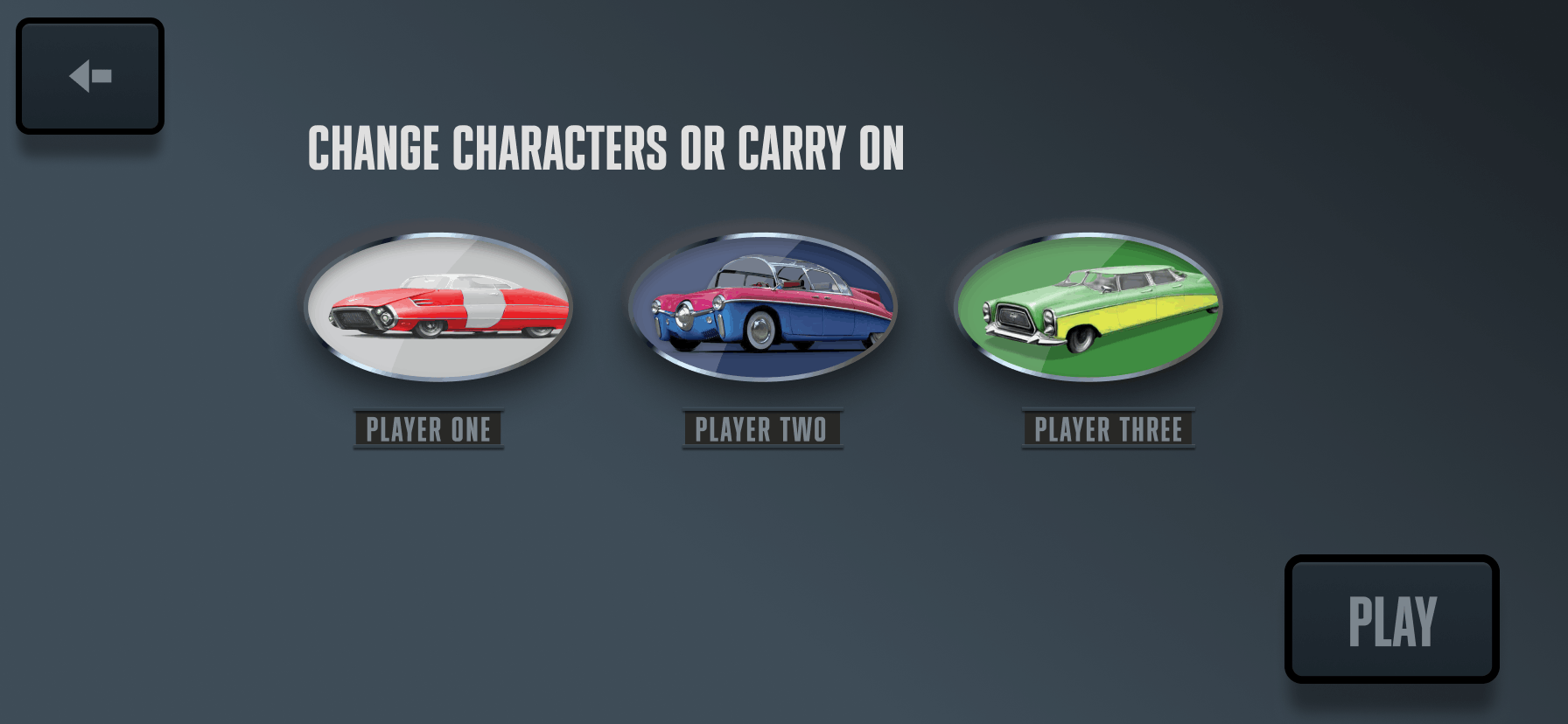
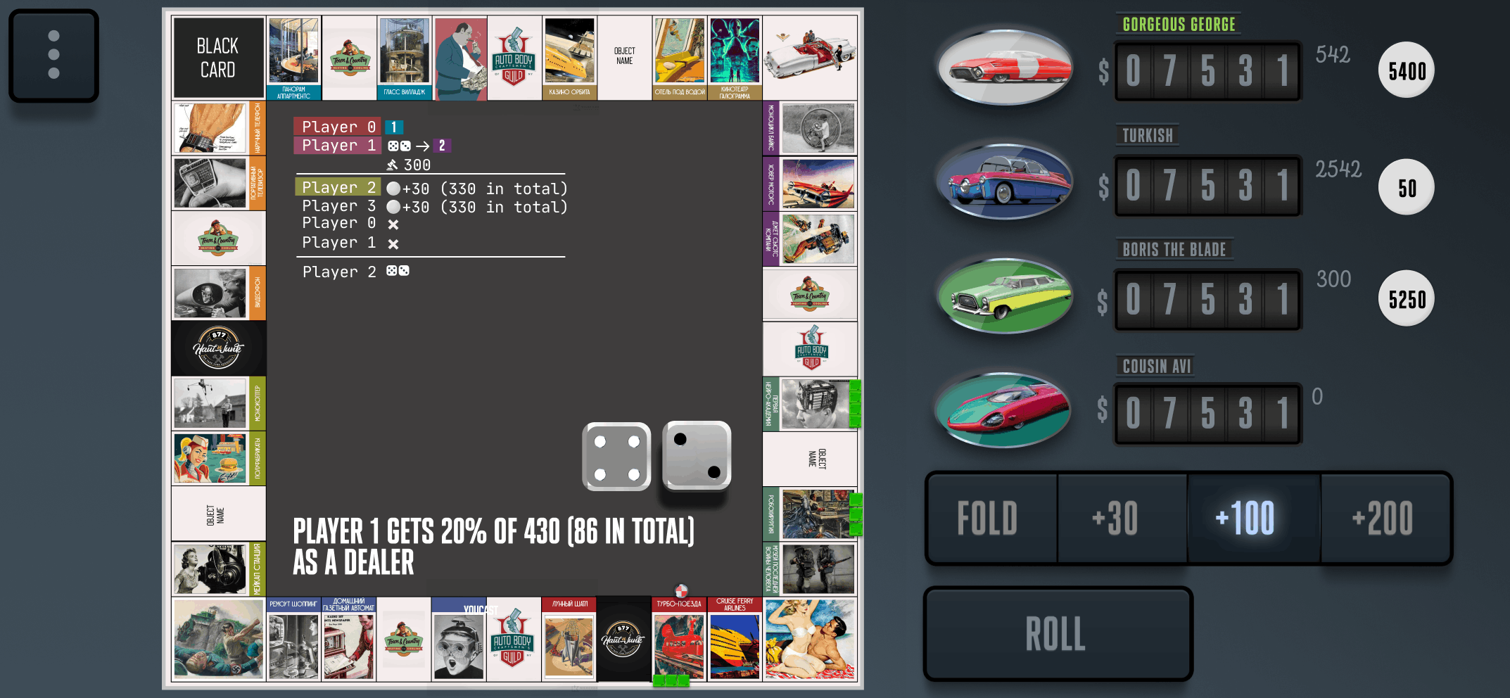
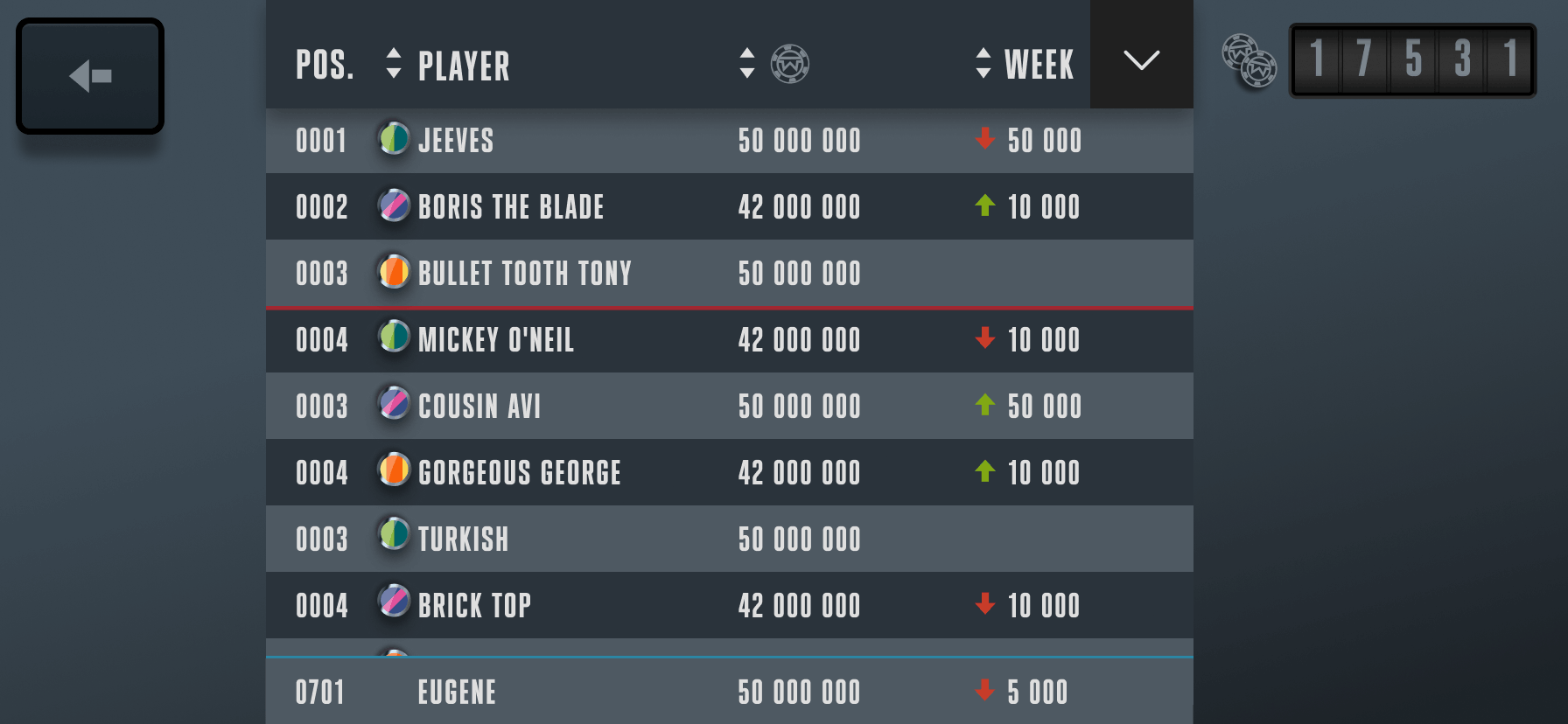
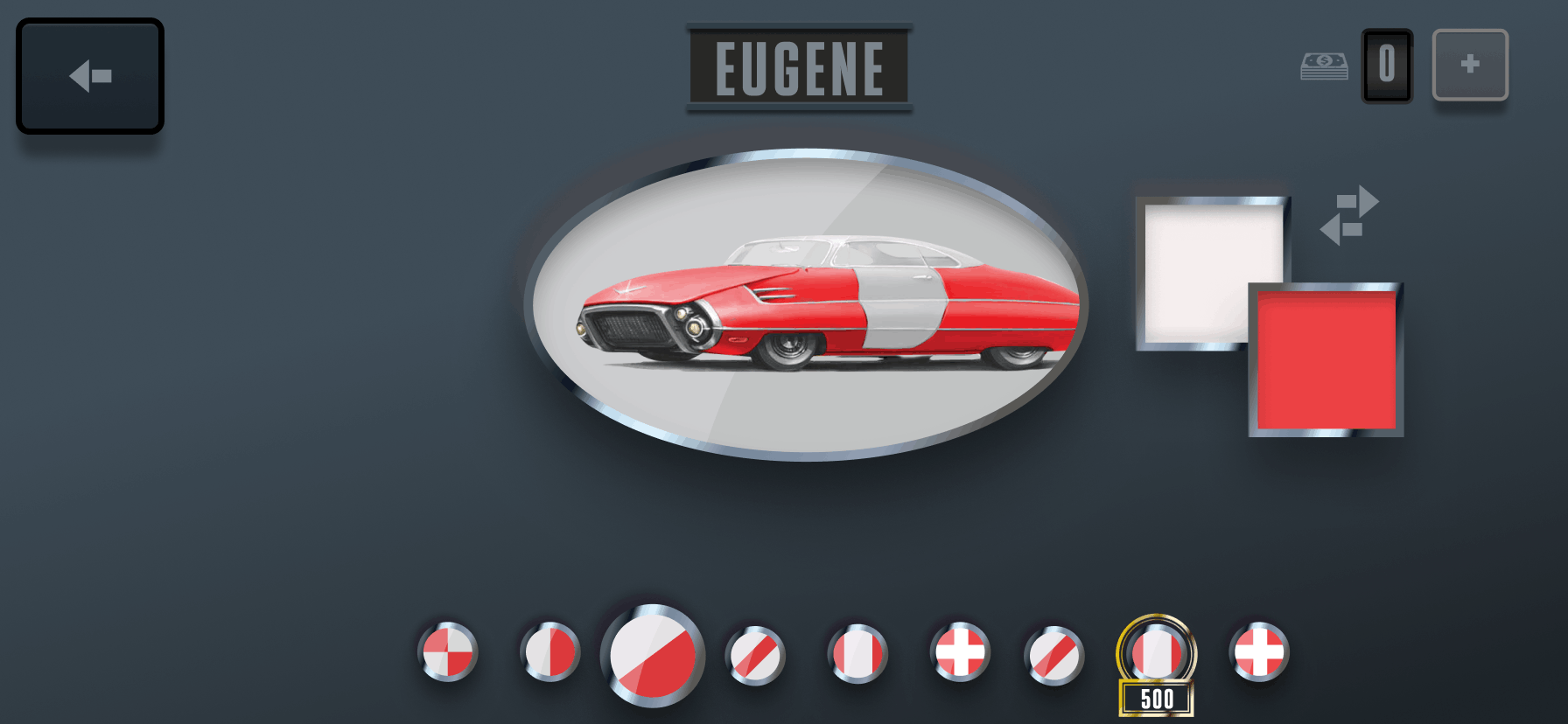
- Player emblem and pieces built from geometric shapes and colours, forming badges with many variants and paintable hover cars as player pieces.
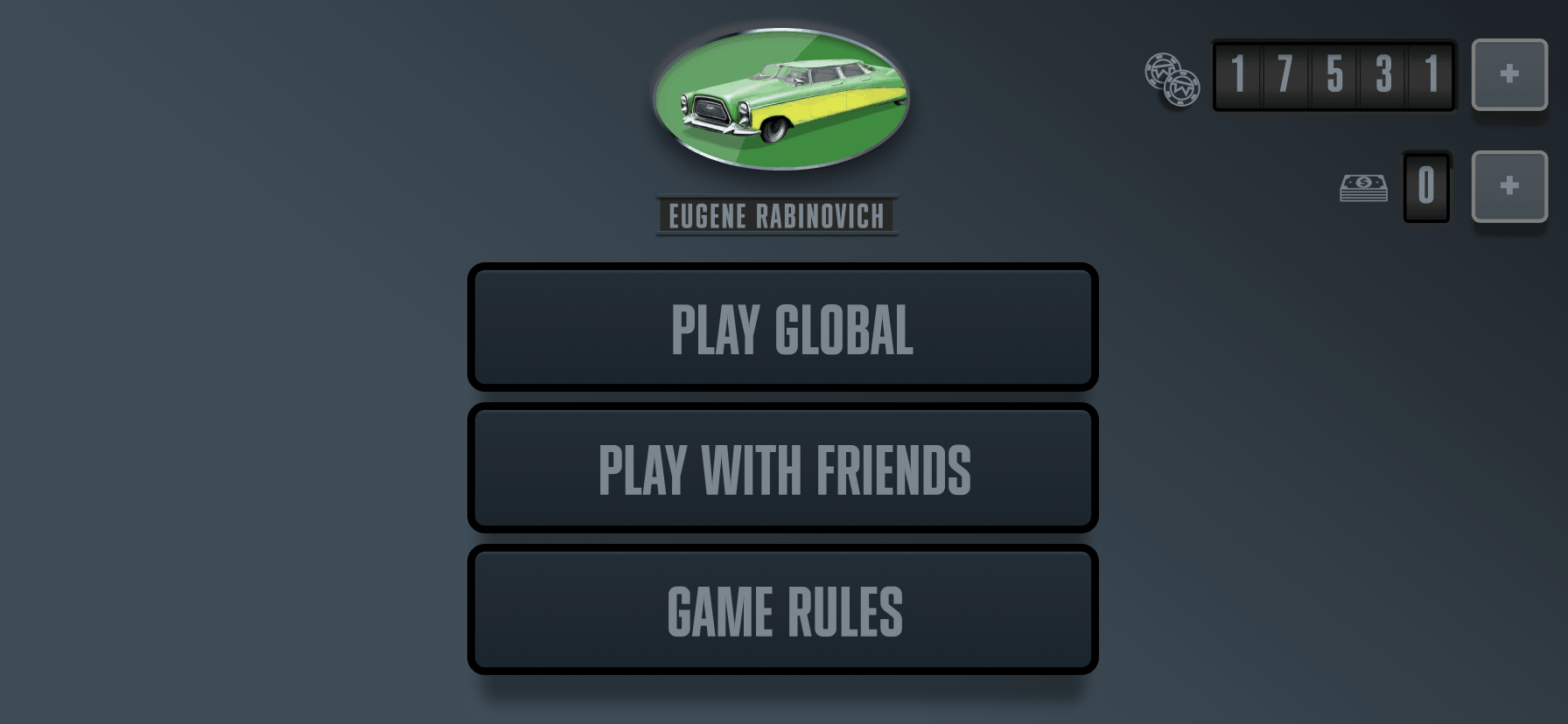
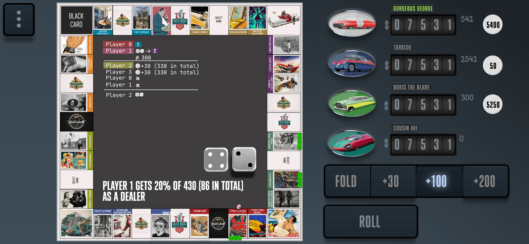
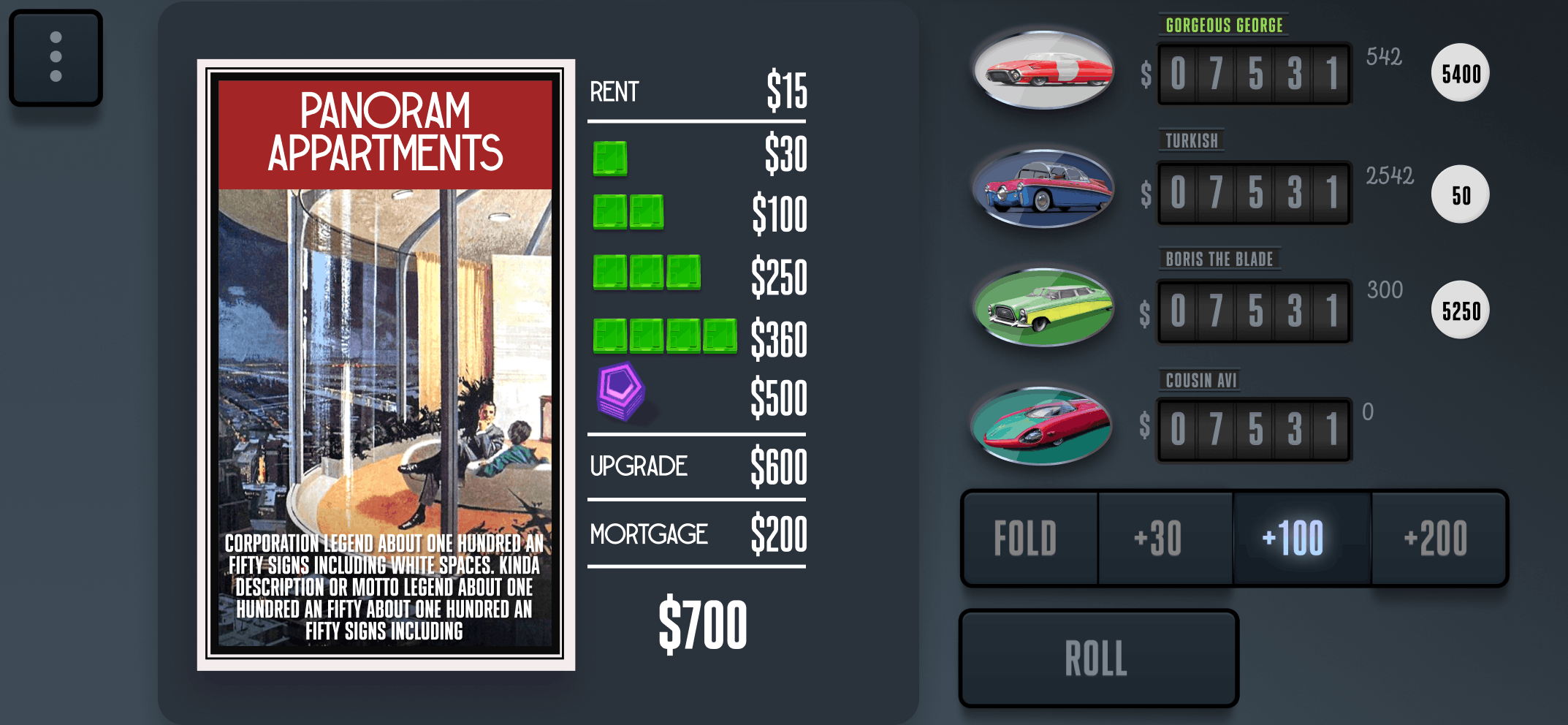
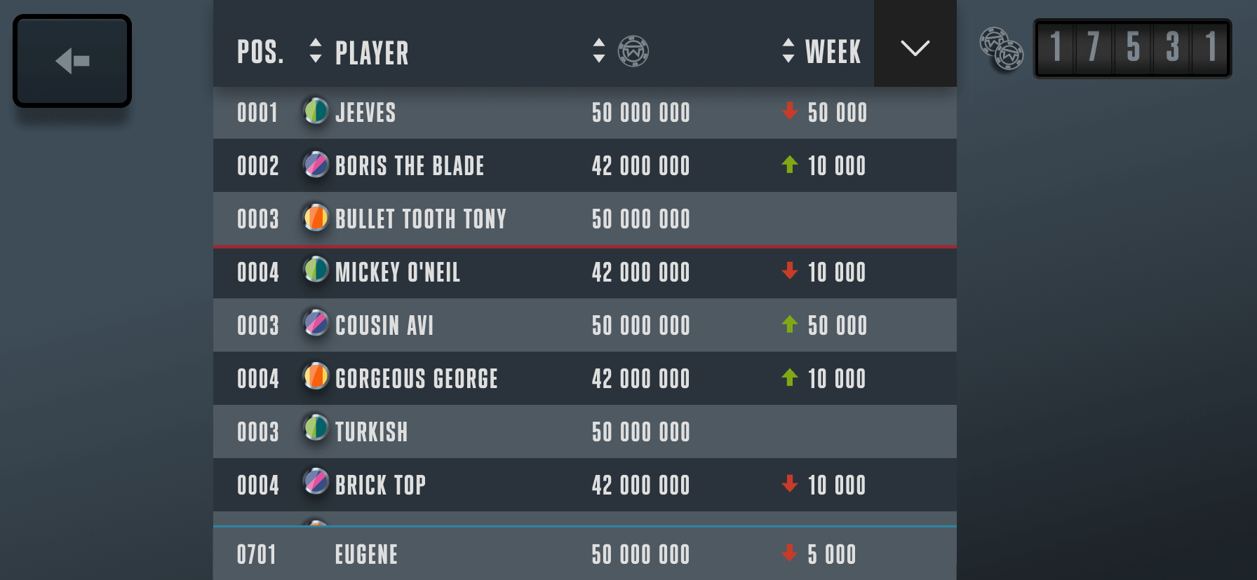
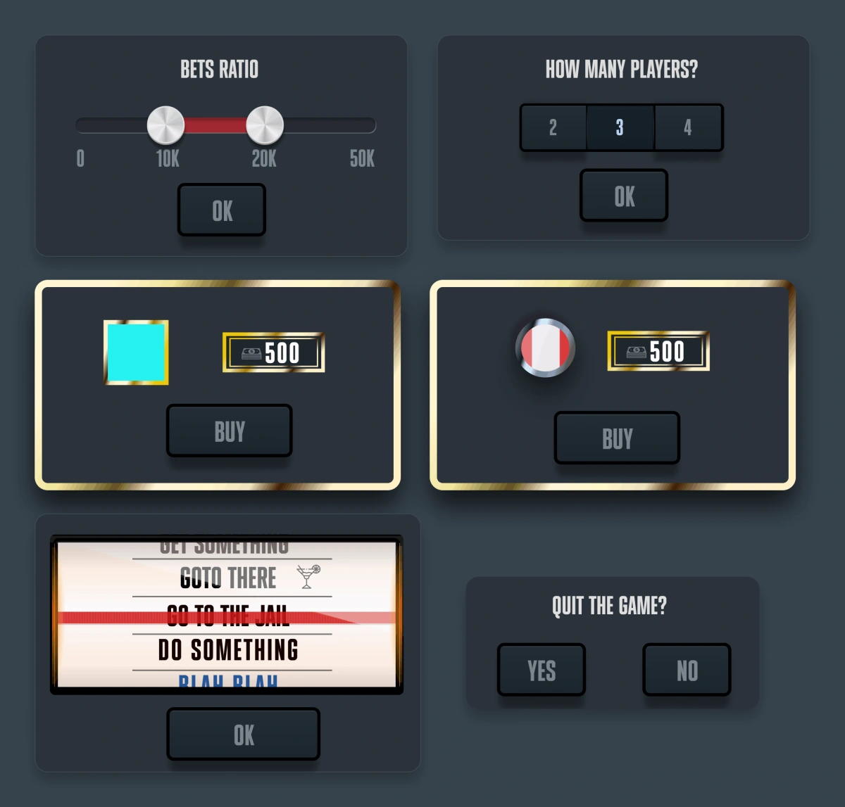
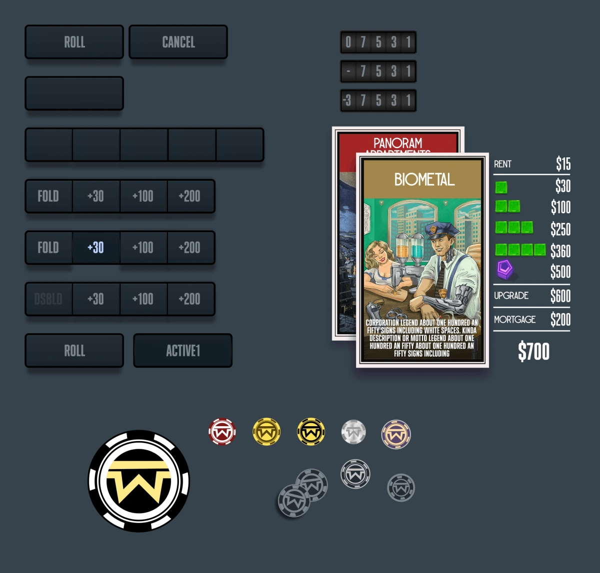
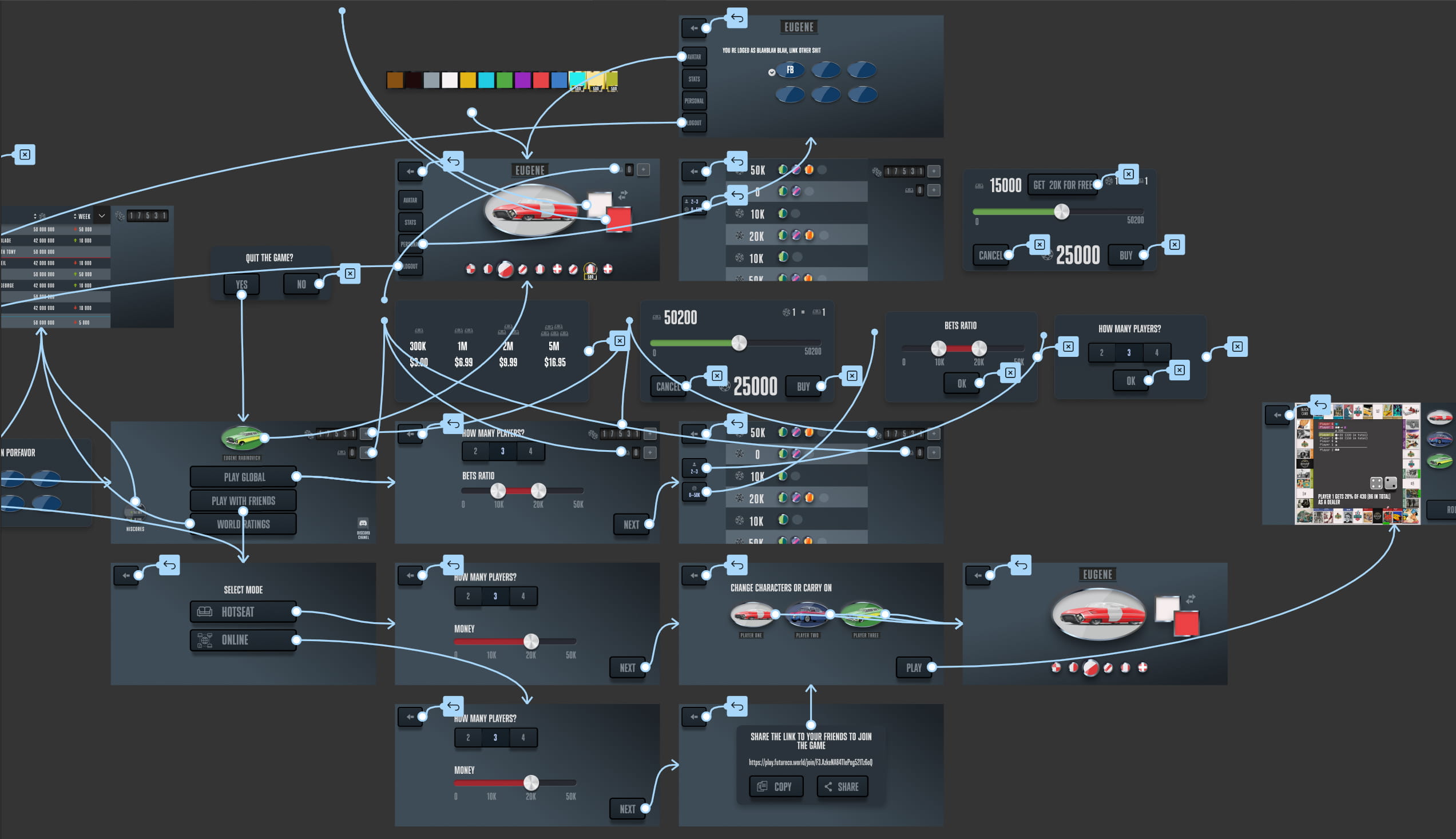
- UI inspired by dashboard and radio design from 1950s automobiles
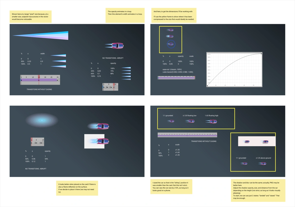
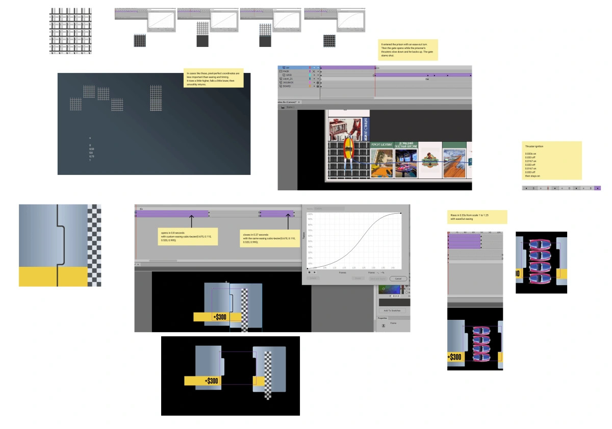
- Animations covering takeoff, landing, interaction between cars
- Currency designed as tokens, gold bars, and banknotes representing different resource types
- Replacing pieces with cars naturally defined what to monetize and customize: the player's fleet